 All I did here was to make the background black and white wile keeping the flames and Cillians charcter in color it separates and focuses the image a bit compared to the original.
 All I did here was to make the background black and white wile keeping the flames and Cillians charcter in color it separates and focuses the image a bit compared to the original.
 Come and See is one of those pieces of cinema that will never leave me. Very few have ever seen this russian film but is is the most powerful antiwar film I have ever seen. Come and See dose not romanticize war it shows it for what it is dirty and horrible. We watch the loss of innocents of Kravenko a child whose life is forever changed by Nazi occupation in Russia during WWII everything is taken from him and he is just trying to survive. I love this image it is so raw and you can see his pain and anguish grinding his teeth and holding his head like it is about to split in half it is captivating in every sense of the word. I took this image and tried to make it look caked in blood and dirt layers caked on top layers of the filth of what is happening. The image also lends itself because of Kravenko arm that he is trying to shield himself from it all but he cannot and he will never be the same.

 So here is two covers for two different versions of the same movie the original 1997 german release and the 2007 American one. Both versions are directed by Michael Haneke and are essential shot for shot to each other. These films are horrifying and yet comical they make you shiver and close your eyes in anticipation of what is about to happen. The thing is throughout these films you never see the actual act of violence is all in implication and that is far worse your mind takes over and you imagine what isn't visually there, this is far more effective than the approach of films like saw or hostile. With these covers I wanted them to do a bit of the same you really are not sure what is going on but in you mind you know it isn't good you can kinda find yourself filling in the blanks which can lead your mind to dark places. I find these images to have a very unsettling effect even though they are really showing you nothing and that is how the films are. I did one for each version of the film figured it would make a nice criterion collection box set.
 I loved the image from the film of DeNiro performing in front of the black and white audience pasted on the wall. It is a great scene in the film showing his psychotic obsessive delusions of grandeur, but the shot by itself does not pop enough. It feels muddy as a poster so I took a front color shot of DeNiro and replaced the silhouette.

 With this cover I wanted to try and make something out of nothing, which is not my forte. I have never seen this film though I want to, and there are very few images online, most of which are tiny. This is what I came up with.


 I just made this one... not sure how I feel about yet, but I figured I would share it. To me, even though A Tale of Two Sisters is a horror film it is also a very dramatic film so I tried to portray it dramatically while still giving it a ghostly eerie feel. This is another design that has about 6 layer overlays of texture to accomplish the feel I wanted.
 When I think of 2001 I think of the mysterious black object. Provided, there were several shots of this I could use but this one is my favorite, so sterile. Thank you to Kubrick's brilliance; perfectly framed and flawlessly symmetric. After that all I did was place the equally beautiful image of HAL's reflection on the astronaut's mask.
 So The Conformist is one of the most visually breathtaking films I have ever seen. Trying to find good images was so easy. Trying to find appropriate ones was a little harder. I took a shot I adore of Marcello about to sell his soul because he is weak because he is afraid. The shadow overlay symbolizes Marcello's regret and hatred of himself for his weakness.

 This cover is inspired by the "A Clockwork Orange" book jacket (shown below). It's an image that I love and it was in my view when I was trying to figure out what to do with this cover. It just made sense. Provided, Old Boy is not A Clockwork Orange, but nothing is. There is something about the content in Old Boy that gives me the same feeling I get watching Clockwork. Therefore, it is a bit of a tribute to one of my favorite classic films within one of my favorite new ones that carries on the spirit of great fearless filmmaking. (Side note: I hate you, Steven Spielberg and Will Smith, for having the audacity to try and remake Old Boy)


 There is not really deep meaning to this design. It just shows the beauty of this film and the breathtaking Australian outback. I took the original frame, played with the contrast a bit, painted over it in photoshop through a watercolor filter, and then overlaid it to make the colors pop and make the picture to feel more like a painting.
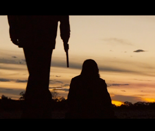


 This may be my favorite cover that I have created. It's just crazy, fun, and trippy. I took a classic image from this 1920 German masterpiece of Avant Garde and modified it to conjure the feeling I got from the movie. My intention is for it to feel like a diorama inside a wooden cabinet or box. I tried to create this by using a picture of wood texture and piecing together with a little perspective and shading. The rest is much of the same: taking selected elements from the original image, enlarging them, and adding some shading and perspective to make it feel 3D on a 2D plain. If you haven't seen the movie, this is how I think the basic sets feel.


 The is one of the first designs I made and still one of my favorites. Provided, in my mind, it is one of the most difficult and powerful films ever made and my favorite film as well. This image comes from right around the fall in the film where everything starts to go downhill, the mood changes, and the world falls apart. We see Harry (Jared Leto) and Marion (Jennifer Connelly) sitting on the couch mere feet from each other yet worlds apart, unable to connect, ashamed of their own actions and the actions of each other. I think, at its heart, that is the real idea of the film: people's inability to quite connect; so close, but not quite. The rift that causes that makes our characters fall, retreating into their addictions, and eventually destroying themselves and each other.
 This cover I did without any actual images from the film due to the fact I couldn't find any good ones, and, as it hasn't been released yet, I can't really screen capture anything from the film itself. The image you see is that of the apartment complex in Naples in which most of the film takes place. It is such a central part of the film and a representation of the numerous characters and shorelines that I think it works perfectly in conveying this amazing film. I then added an overlay of splattered blood staining and tainting the location much as the Commora Mafia that occupies it does.


